# Phoenix LiveView MultiSelect Component
This project implements an Elixir Phoenix LiveView component that has a capability
of selecting multiple checkboxed items from a list.
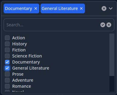
The component supports the following options:
- Selection of multiple items from the given list of options
- Limit the max number of selected items
- Ability to either wrap the selected tags in the main div of the component or
collapse them in a single tag
- Ability to search in the list of options on the client side or on the server
side
- Support of light/dark color themes
Here's a sample [video](https://user-images.githubusercontent.com/272543/215292190-7932a617-10d4-437a-8ab5-5181461c2c38.mp4) illustrating what this component looks like in action.
This component is inspired by [this article](https://fly.io/phoenix-files/liveview-multi-select) but is a complete rewrite with added features for
usability.
## Author
Serge Aleynikov
## Installation
Include the project in the `mix.exs` as a dependency:
```elixir
defp deps do
[
{:phoenix_multi_select, "~> 0.0"},
...
]
```
Run `mix deps.get`, and `mix multi_select.install`. This will modify the following
files:
- `assets/tailwind.config.js` - to add the necessary color alias, and search path
- `assets/package.json` - to add the tailwind scrollbar customization
- `assets/js/hooks/multi-select-hook.js` - copied from the multi_select source
- `assets/js/hooks/index.js` - add the MultiSelectHook
## Usage
In your project locate this file `{{your_project}}_web.ex`, and add:
```elixir
defp html_helpers do
quote do
...
use Phoenix.LiveView.Components.MultiSelect ## <--- add this line
...
end
end
```
Now in the `*.html.heex` templates you can use the `multi_select` LiveView
component like this:
```html
<.multi_select
id="some-id"
options={
{id: 1, label: "Option1"},
{id: 2, label: "Option2"},
...
}
/>
```
For list of the available component's options see
`Phoenix.LiveView.Components.MultiSelect.multi_select/1`
## Customization
- In order to add a custom class name to the `multi_select` component so that
it can be customized in your CSS files, add the following option to `config.exs`:
```
config.exs:
===========
...
config :live_view, :phoenix_multi_select,
class_prefix: "some-class-name"
```
- You can also override the build-in CSS classes for every aspect of the
component's presentation by defining a custom callback module, that implements
a `apply_css/2` function, which will be called to get a string of CSS classes
for every part of the component. Here is an example where the `primary` color
is replaced by `pink`. See the `@css` attribute in
[multi_select.ex](https://github.com/saleyn/phx-multi-select/blob/main/lib/multi_select.ex#L148) for the list of permissible `tag` values passed to the `apply_css/2`
function.
```
config.exs:
===========
...
config :live_view, :phoenix_multi_select,
class_module: MyModule
my_module.ex:
=============
defmodule MyModule do
def apply_css(_tag, def_css_classes), do:
String.replace(def_css_classes, "primary", "pink")
end
```
## Demo
The demo project is located in the `examples/` directory, and can be compiled
and run with:
```
cd examples
make
make run
```
Now you can visit [`localhost:4000`](http://localhost:4000) from your browser.
